Simple design is good design
There is a lot of non-sense out there and a lot of bad decisions when it comes to the look and design of your website
This is my attempt to steer you in the right direction. Let’s make websites that don’t suck!
Why is it that design is so important? Well, there are studies that show that it takes a visitor a whopping .05 second to make an opinion about your website. Now, I don’t know if that’s true, I read it online. That seems awfully fast to me.
Here’s what I do know, your website for sure doesn’t load that fast. And, it doesn’t matter what the actual time is, we all know that people make near instant judgements. So you have to make that first impression a good one, other wise your visitor will just go to one of the million other sites out there.
Another important number to note, 40% users will leave a website that has a layout that they don’t like. So how do you avoid this? Your best bet, is to keep you design simple.
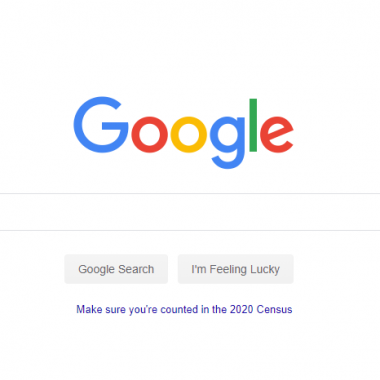
Think about how many people use Google. The homepage of Google is one of the simplest designs out there. Now you don’t have to copy Google, but be more like big G, not less.
- Keep Text to a Minimum
Now like everything, this depends, but unless you are writing an investigative journalism article, keep your text to a minimum. A good general rule is to use less than you think you need. Basically this rule applies mostly to homepages and landing pages that get a lot of traffic.
Think about it. How often do you go to a homepage and it’s an article? Unless it’s a blog roll, the text should be simple and to the point.
I often suggest to web designers to study some basic direct response copywriting. The founder of a design company told me about this and it’s been a great shortcut. A copywriter is very aware of not only the words they use, but how they take up space. You’ll get a lot of benefit that is helpful to your design projects if you understand the basics of copywriting.
- Short. Sentences.
Did you read?
What I wrote above?
This is from copywriting.
Ok. I’ll stop.
Here’s a great article to read about this: Basic Copywriting for Web Designers (and Why It Matters!)
- Calls To Actions Need To Be Obvious
Do not make your visitor guess what you want them to do. Do not even make your visitor think. Tell them, like they are a little child, exactly what you need them to do.
Sign Up For Free Newsletter Here.
And you are going to want to put this call to action, that is clear and concise, in a very obvious place on the page. And then your going to want to put it on another obvious place. For example a FREE SIGN UP button might be good right in the middle of the page, and then again at the top right of the page as well.
- Navigation Should Be Simple
Have you ever gone to a website and there are top level nav bar and side bar with all manner of buttons as well? Have you ever hovered over the top level navigation and the drop down that appears if just overwhelming?

It’s not easy to simplify you navigation, heck even Amazon’s site is a bit too much, but it definitely helps your user.
Have you ever gone to the store to buy some spaghetti sauce. You think it will be a simple task of just getting some sauce, until you are confronted with the mega isle of 1,000 different sauces. And that’s just the red sauce. And then you are paralyzed because you can’t figure out which one you want.
It’s because you have too many choices.
This is the same thing that happens when you have to many things in your navigation. It overwhelms the user and they will usually just leave your website. As always, best to keep it simple.
- Mobile Friendly Page
Ok, this is an important distinction to make, you need to not only pass Google’s Mobile Friendly Test, but your site needs to actually be useful to a human using a cell phone. So yes, definitely make sure you pass Google’s test, but also bring up you site on an actual phone and see how it works.
You’d be surprised how many sites can pass the Google test, but not the human one. The human mobile friendly test is more important!
- Make It Easy To Get To The Homepage
This is so important that it can be overlooked.
You always want to have your logo on the top right of your screen, even on mobile devices, and your logo need to be clickable. And when your user clicks on the logo it needs to take them to your homepage.
Also, by having your logo on every page and having it clickable to the homepage, you don’t need to have a redundant button labeled “Home”, because your logo takes care of this for you.
- Be Consistent With Your Color Scheme
Branding is all about consistency in all your messages and this extends down to your colors that those messages are on.
Is the logo of the company green and white? If so you’re going to want to stick to predominately those two colors. And remember, think like real, big brands. Think of branding like Coke.
Coca-Cola always uses not only the same font for their logo, they use the exact same color red on everything. I guess technically they also use white, but you understand the point I’m making.
So, how can you put this into action? In a word simplify. Remove stuff, words, images, colors, navigation elements, and everything else that is unnecessary. Answer the question that the visitor has, then move them to the action you want them to take as quickly as possible.